

Simplicity is the ultimate sophistication.
Leonardo da Vinci
When we began to visualize our new edition of Shakespeare’s Sonnets, just a few ideas stood out. We wanted an intimate volume where each sonnet would be presented on its own page and where each verse would stand on one line, regardless of its length. Visually, we wanted our edition to resonate with the books produced by the early fine presses: Handmade paper with deckle edges, an authentic limp-vellum binding, and types that have their roots in classic early printing.
Our access to typecasting matrices for Cloister Old Style (designed in 1913 to resemble the Jenson-based types of the Kelmscott Press) made the choice of font easy.
William had already begun casting our own metal type after we acquired our first Monotype Thompson casting machine (as told in Our New Typecasting Foundry). But preparing the type for Shakespeare’s Sonnets turned into an adventure on a different level.
Custom Word Spacing
After we had cast enough type to start, the typesetters began setting our initial modernized text. In our initial tests with Cloister Old Style, we found the standard 5-to-em word spacing appeared too tight for our taste, and the 4-to-em too loose. Since none of the sonnets have justified lines, the choice of the correct spacing would affect the appearance of the entire book. But what a pleasure to realize that casting our own type enabled us to cast our own custom word-spacing material! Our 4.5-to-em word spacing made our lines look just right.
Fitting the Page Format to the Text
Once we determined the length of the longest lines, we added appropriate margins on all sides to establish the page size. This gave us a page slightly taller than wide, a comfortable shape but a far cry from the usual tall & narrow format often seen as ideal for fine-press books. A handful of the longest verses would be allowed to extend into the right margin, to avoid skewing the average page layout.
Paper was then ordered from Twinrocker and parchment ordered from England. We would be printing our pages ‘four-up’, that is in Quarto format, and having the paper made to the exact page dimensions (rather than trimming it to size) allowed us to retain the natural deckle edge on both the fore-edge and bottom of every leaf.
Return to Original Orthography
Our mid-stream decision to abandon our modernized version and return to the original text (see Editing Shake-speare’s Sonnets) caused major reverberations throughout the project. Since we were no longer printing a modernised text, the layout and typography would have to be adjusted. The typographic design of the 1609 Quarto edition would have a stronger influence, and colour and decoration now felt out of place. The only survivor was our Tudor Rose ornament, which now adorns the title page and cover in gold.
But the most significant technical challenge in returning to the original text was to restore the use of the antique ‘long-s’ and its multiple ligatures. Anything less (such as using modern ‘s’s instead, like the Kelmscott and Doves Press editions) would be an unacceptable compromise for us.

In the early days of printing, and through the 18th century, most Latin languages used two forms for the lowercase letter ‘s’: The one we know and use today (s), which normally occurred only at the end of a word, and the ‘long-s’ (??), shaped similar to an ‘f’ and used at the beginning and middle of a word. Since the tops of both the ‘f’ and the long-s extend over the next character, they can physically collide (and break off) when followed by certain taller letters (like ‘i’, ‘l’, ‘h’, etc.). These pairs of letters are traditionally combined into one separate piece of type called a ‘ligature’. In modern English, ligatures are only needed for a few ‘f’ combinations: f-i, f-f, f-l, f-f-i, and f-f-l. The long-s, however, requires ligatures for s-i, s-b, s-h, s-k, s-l, s-s, s-s-i, s-s-l, and s-t. Very few modern fonts of metal type contain these “archaic” or “quaint” characters, and certainly not our Cloister Old Style. We would need to design and engrave new matrices, and cast these new types ourselves.
Origins: The Jenson Types
Cloister Old Style is one of a number of modern fonts (including the Kelmscott Golden type and the Doves type) that were based on the 15th century letterforms of the Venetian printer Nicolas Jenson. We examined two leaves from Jenson’s original printed books to guide us in making our new character designs historically consistent.

A lowercase ‘f’ includes a cross-bar that is supported by the body of the type, while a ‘long-s’ has no cross-bar. While this should result in a narrower body for better letter-spacing, it would also remove support for the overhanging portion of the letter. And in fact, we saw that Jenson himself had left the body of his long-s wider, leaving a somewhat unsightly space before the next letter. In order that our own version would not suffer from poor letter-spacing, we chose to modify the curve of the arc to reduce the overhang a little.
Designing the ligatures was easier, as we simply needed to join the two letters together gracefully, and that gave us freedom to play with the letterforms a bit for our new creations. We first followed Jenson’s design for the ‘st’ ligature, but then produced one with a rounder loop, inspired by the German eszett (ß). Both forms found their way into our text.
Preparations for Matrix Engraving

Our need for tools to engrave new matrices coincided with the dispersal of Mike Anderson’s engraving and casting equipment shortly before he passed away. (Mike had taught William how to operate the Thompson caster one summer at “Monotype U” in West Virgina.) After loading two Thompson casters and a Deckel pantograph engraving machine onto a rental truck, William paid a quick visit to Stan Nelson, then drove to Massachusetts for a three-day session with Jim Walczak to learn his own methods for matrix engraving. Then the machines began the cross-country trip to their new home in California.
Engraving the Matrices
Our 80-year-old Deckel engraving machine is similar to one Frederic Goudy used for his own type designs. But restoring it took more time and energy than planned, and mastering its use even longer.

The Deckel G1L is a two-dimensional pantographic engraver, where the operator traces a larger pattern to control the smaller high-speed engraving tool. Even a small misadjustment of the pantograph arms can distort the final shape of the letter. Looseness in the bearings, an inaccurately sized tracing tool, and unwanted vibrations from the motor all can make it difficult to accurately reproduce the design of the pattern.
The resulting letters may be too thin, too fat, too rounded, sloped, twisted. Moving the tool too far, too quickly, or improperly can break the tip of the delicate engraving tool. Jumping outside the pattern creates a corresponding cut in the matrix blank, producing an unintended raised type surface. We know, because all of these things happened to us.

While minute variations (of as little as 1,000th of an inch) may not be visible to the eye in a larger point size, in 14-point Cloister, tiny errors may make a character stand out like a letter from a completely different font.
Reverting the Type in Two Passes
We would be transforming our 154 pages of type in two phases, so that our typesetters could begin before the new characters were finished. The first phase was reverting all spellings from the modernized version to the original: ‘u’s and ‘v’s were swapped out, ‘j’s were removed and replaced with ‘i’s, and all the uniformly spelled modern words were returned to their inconsistent and variable forms in the Quarto.
Finally, after we succeeded in producing suitable matrices for all the additional characters we needed, the typesetters began the second phase: replacing the modern ‘s’s with long ‘long-s’s and their ligatures.
And More: Custom Initials
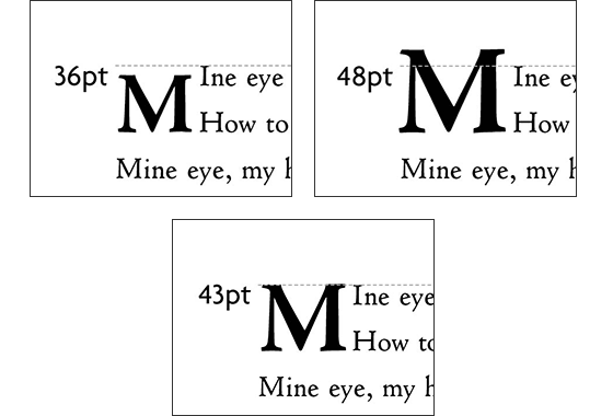
Another important feature of the typography of the Quarto was the use of a 2-line drop capital for each sonnet, followed by the capitalization of the next letter in the text-size font. The choice of size for a 2-line capital depends on the leading (line-spacing) of the text for correct alignment.
When we measured the leading of the verses (decided very early in the design process, and locked in by the paper and parchment now already on our shelves), we found that the appropriate size capital would need to be… a 43pt letter. In other words, a size well between the standard 36-point and 48-point characters.
We investigated having plates made, but we couldn’t find anyone who would make the individual plates that small. Plus, if we did use plates, we would have to have an entire second run through the press just to put the capitals on the page. But wait, we know how to make our own matrices now! All we needed was larger patterns that would scale down to the required 43-point size.
The entire set of 17 drop-capitals were finished in a matter of days: patterns were made, matrices engraved (with far fewer errors this time) and the needed characters were cast very quickly. Our custom initials were easily included next to the text type on the press for printing together.
Epilogue
The press’s purchase of typecasting and matrix engraving equipment was a gamble that gave returns beyond expectation. Although the learning curve was steep, our new facilities immediately made possible the Petrarch Press’s most important work to date: Shake-speare’s Sonnets.

Related:
Shake-speare’s Sonnets
Editing Shake-speare’s Sonnets
Our Typecasting Foundry